Dutch Language Learning
Tech Stack
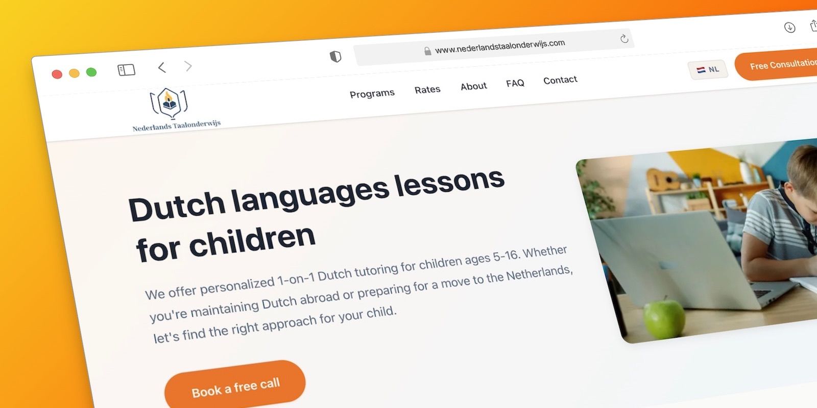
An online platform for personalised 1-on-1 Dutch language lessons for children aged 5–16, delivered remotely by native-speaking tutors.
Overview
Nederlands Taal Onderwijs (NTO) is an online Dutch tutoring service offering personalised 1-on-1 lessons for children aged 5–16, taught remotely over video by native Dutch speakers. The focus is conversational fluency rather than exam prep, with each lesson shaped around the child’s own interests.
Who it’s for
- Expat parents keeping their children’s Dutch alive while living abroad
- Mixed-language families looking for structured support with bilingual development
- Families relocating to the Netherlands preparing a child for school there
What it offers
Four tiered programmes meet children where they are: Foundation Years (5–8), Growing Fluency (8–12), Teen Fluency (12–16), and an Intensive Prep track (2–6 week accelerated). Around the lessons sit the things that make remote tutoring actually work for families:
- Flexible 30- or 60-minute sessions across weekdays, weekends and time zones
- Lessons customised to each child’s interests to keep them engaged
- Monthly progress reviews
- Guidance for parents on reinforcing the language at home
Delivery
Entirely online — video lessons with native Dutch-speaking instructors — so the service reaches Dutch families wherever they live. The site is offered in both English and Dutch.
Under the hood
The site runs on Next.js (App Router) with TypeScript and a MongoDB-backed Payload CMS as a headless content layer, so the tutors can edit programmes, pricing and page copy without touching code. Payload was chosen over WordPress on purpose: instead of bending a PHP-and-plugins stack to fit a modern React frontend, Payload gives a code-first, type-safe content model that lives in the same TypeScript codebase as the app — one language, one repository, no REST/ACF glue in between. The one rough edge has been media: Payload writes uploads to the local filesystem by default, which doesn’t survive serverless deployments where the disk is ephemeral, so images added through the admin can fail to load in production until media is moved to a persistent store (a cloud-storage adapter such as S3) and Next.js’ image host config is pointed at it.